Back to Projects

At A Glance Page
Built the public At-A-Glance Statistics page for the Glenda Gordy Research Center, translating raw crime data from Harris County and Texas DPS into a responsive, accessible dashboard with stat cards, donut charts, bar charts, and year-over-year comparisons.
Next.jsTailwind CSSJavaScriptPythonSQL
<2s
Page Load Time
2
Data Sources
4
Crime Categories
The Problem
The Glenda Gordy Research Center publishes crime data sourced from Harris County District Clerk records and Texas DPS reports. That data lived in internal systems that the general public had no way to access or interpret.
The center needed a public-facing page that updated regularly, presented statistics clearly without overwhelming non-technical visitors, and did so without exposing raw records or internal infrastructure.
My Approach
I built a hybrid data-ingestion pipeline that pulls from two sources on a daily schedule, aggregates the relevant statistics using Python, and stores pre-computed results so the frontend never queries raw data directly.
Next.js API routes act as a secure gateway between the frontend and the data layer. The public endpoints only return aggregated, pre-approved statistics. No raw records are ever surfaced.
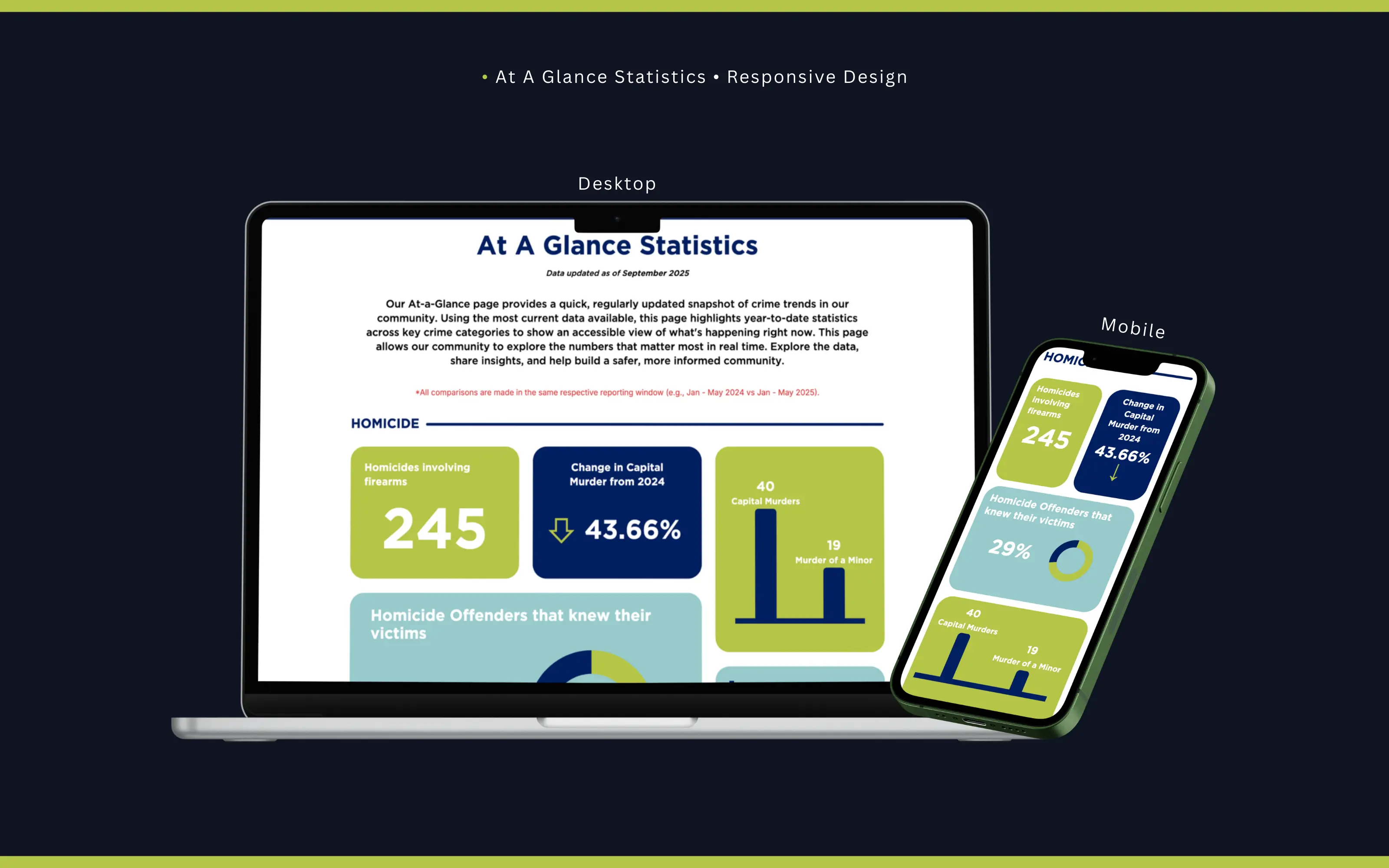
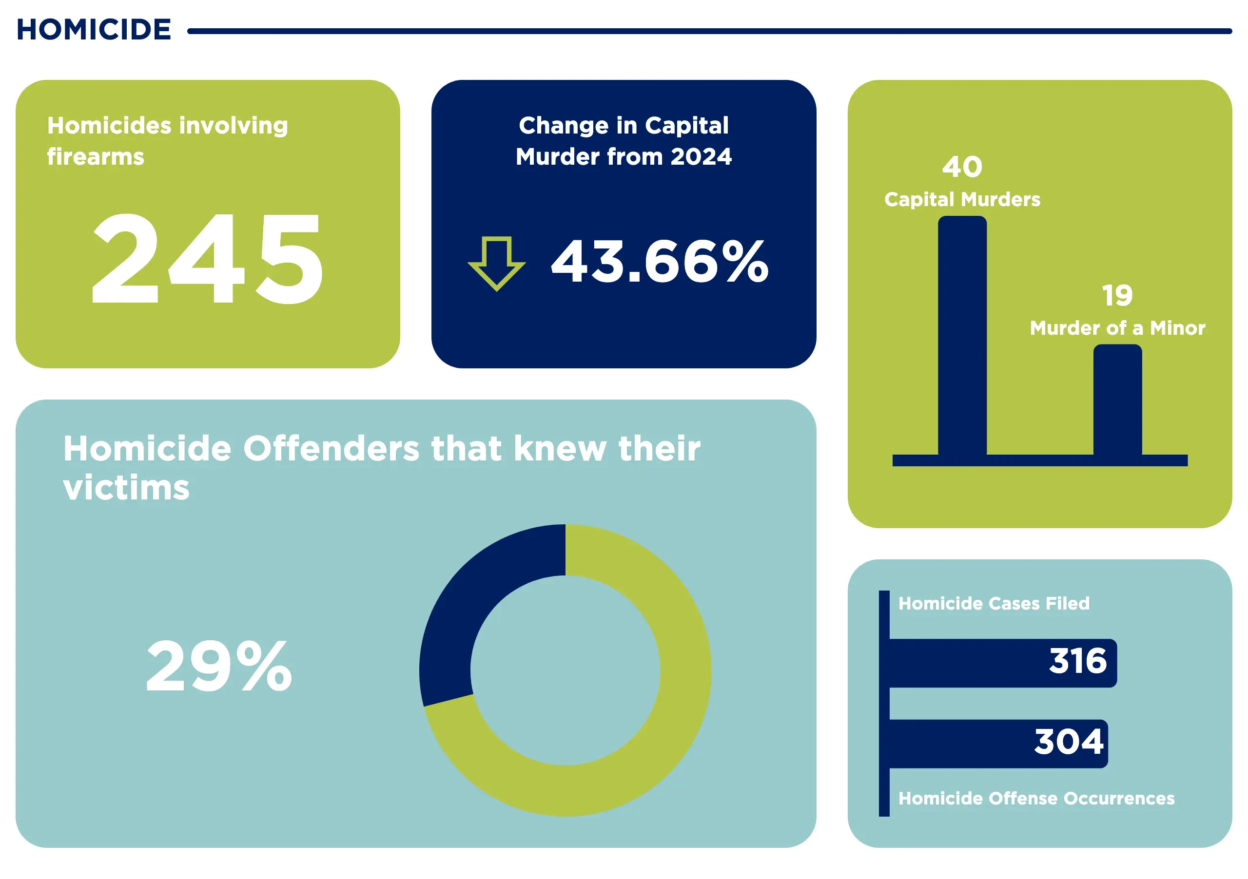
The UI is organized into crime categories, each with a consistent card layout: a large stat callout, a year-over-year percentage change with a directional indicator, and supporting charts (donut and bar) for context. Tailwind CSS keeps the layout responsive from desktop down to mobile.
Visual Showcase
Responsive layout across desktop and mobile viewports
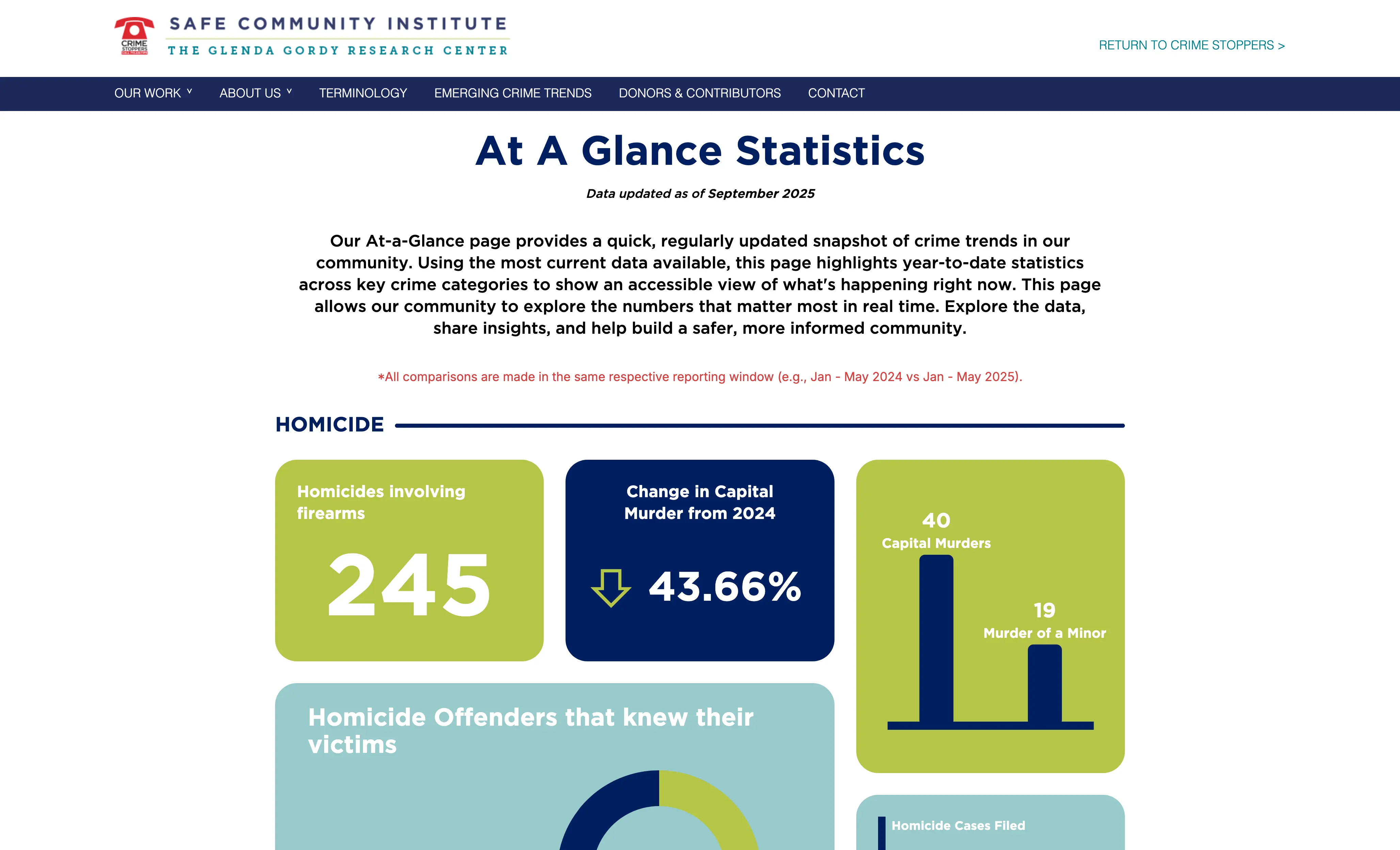
Homicide section showing stat cards, donut chart, and bar chart
Weapons section with a 5-month occurrence trend chart
Page header and Homicide section on load
Technical Deep Dive
Python handles all data processing. Using pandas, the scripts normalize records from HCDC and DPS, which have different schemas and update schedules, into a unified format before writing to the database.
Caching happens at multiple levels: aggregated stats are pre-computed on ingestion, API responses are cached in-memory, and static assets are served via CDN. This keeps page load times under two seconds even when traffic spikes after news coverage.
SQL queries use parameterized inputs throughout. Public API routes are read-only and only expose fields explicitly included in an allowlist, so there is no path to raw record access from the frontend.
Each chart component has ARIA labels and text alternatives so screen readers can convey the same information the visual represents. The percentage change cards use both color and directional arrows to avoid relying on color alone for meaning.
Challenges & Lessons
The two data sources update on different schedules and occasionally have conflicting counts for the same time window. I added a reconciliation step that flags discrepancies and surfaces a data-staleness indicator in the UI rather than silently showing potentially mismatched numbers.
Early versions queried the database on every page load. Under normal traffic this was fine, but after a news mention caused a spike, response times degraded noticeably. Moving to pre-computed aggregates with scheduled refreshes solved this.
Designing stat cards that work for both a 245 and a 15,547 required careful attention to typography scaling so large numbers did not overflow or break the layout on smaller screens.
The biggest lesson was how differently public-facing data tools need to be architected compared to internal dashboards. Internal users tolerate loading states and raw tables. Public visitors need instant clarity, and any ambiguity in the numbers erodes trust.
Want to see it in action?
Explore the live application or dive into the source code to see how it works.